Design for Print
(Photoshop, Illustrator, InDesign)
*click on any image to enlarge
")
")


")


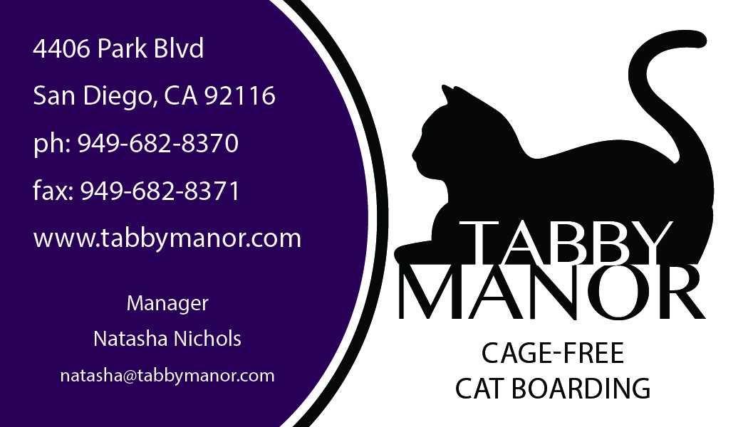


Business Package for Tabby Manor:


This was actually three different assignments I did in the Interactive Media Certificate Program for San Diego Continuing Education. We were instructed to design a logo for the company of our choosing, then create a business package and promotional design. One of my long-term goals is to open Tabby Manor, a cage-free cat boarding facility, so I chose to create a business package for it. (disclaimer: Tabby Manor does not actually exist…yet). I used Adobe Photoshop, Illustrator and InDesign to create this business package. Software Tools and Techniques: I created the logo in Illustrator, using the pen tool to trace different elements from 3 separate images of cats from the internet (one for the head, one for the body and one for the tail) to get the shape of the cat silhouette I was looking for. I used the font Bangla MN Regular in white fill for the type “Tabby” within the silhouette of the cat and the same font in a slightly bigger size in black fill for the type “Manor” to create a base for the silhouette to sit on. I drew 2 rectangles with varying stroke size and no fill for the border, which I ended up removing for use within the business package invoice, letterhead, envelope and business card because it was too busy for those particular designs. For the business package, I chose to stick with a consistent purple and white banner design. I originally used the rectangle and circle tools with pathfinder divide in Illustrator to make the banner. However this didn’t allow me to alter it’s shape and size for the different elements of the business package without it looking skewed, so I ended up using the pen tool to make the purple rectangle, white rectangle and middle white stripe all separate pieces so I could resize and move them independently. After creating the banner, I placed it and the logo into the InDesign document and altered them as necessary to fit the letterhead, invoice, envelope and business card. I used the align tool a lot to align object to page, align different elements to each other and to align to margins. I used the table tool for the invoice. I used a bleed for the business card and direct mailer, but not for anything else to keep costs down (theoretically, if these were to be printed). The promotional design did not specifically need to be for our business package, but I took the opportunity to design a direct mailer advertisement/coupon for Tabby Manor that I may one day us to promote Tabby Manor and generate new clients. I chose to use a simple design for the front to draw people’s attention and used the same purple and white banner design to keep everything consistent and recognizable as Tabby Manor. For this project, I started by setting up the document to fit the required parameters for a direct mailer with a bleed as defined by the USPS and created rectangles (no fill) for the indicia, address area and barcode area, all flush with the edge of the bleed (these are areas defined by the USPS that need to stay free of all text, color and graphics). Once my design was finished, I used these rectangles with the pathfinder subtract tool to delete the colored area of the background that would have been in those designated spaces. I used Photoshop to isolate my cat from the background of my original photo and then placed the cat as a png file into the InDesign file and added a drop shadow. I also placed my logo on the back and used an online generator for the coupon’s QR code on the back of the card. The rest of the mailer was created in InDesign using primarily the rectangle and text box tools. If these were to be printed, I would use a 38”w x 25”h parent sheet, on which I could print 30 mailers using 0.5” margins and 0.375” space between mailers.
Magazine Cover-Startling Elegance:
This was a magazine cover I did in the Interactive Media Certificate Program for San Diego Continuing Education. We were instructed to create a design for a book cover, magazine cover or DVD case cover (using appropriate dimensions) for our assigned title, mine of which was “Startling Elegance”, I used Adobe Photoshop to create this design (This assignment was before I had learned to use InDesign). Software Tools and Techniques: For this project, the title I received was “Startling Elegance”. I chose to create a high-fashion magazine for wealthy women. I also chose to make it an October edition and to keep it fall and Halloween themed, since this assignment was around that time. I had a lot of fun researching articles that would be in such a magazine and coming up with the article titles. I also really enjoyed making the barcode. The most challenging part of this assignment was definitely managing the type. I wanted it to feel like a real magazine. I spent a lot of time choosing the best fonts and altering the size of each word to emphasize what I wanted the reader to focus on without one article being more prominent than another. I spent a lot of time adjusting the leading and placement of each word within each article and each article within the page. I chose a black, red and white color scheme as I felt this was appropriate for an October/Halloween issue. I ended up only using two main fonts, Riky Vampdator Normal and Vonique 64 for the articles’ text and primarily used only the stroke and outer glow effects to keep everything consistent on the page. I did use a different font, Marbre Sans, with a bevel and emboss effect and drop shadow for the title “Startling Elegance” so that it stood out more from the page. After a LOT of trial and error, I feel that I was able to make the cover look balanced while keeping the type legible but still interesting and keeping everything consistent with my Halloween theme. I purchased the two images of the women as well as the two images of smoke from https://stock.adobe.com/. I primarily used masking for the images. I applied a mask to the woman with the apple so I could put her in front of the blue smoke and the title. I used the grey smoke image twice (I flipped it horizontally to fill out the middle of the image better) and then applied a mask to it using about a 10-20% opacity and fill, and repeatedly painted the mask on until the two images of the women blended seamlessly via the smoke. I found two images of bats on Google and, using the pen tool, traced the shape of the wings from one and the head from the other to create the bat shape for the barcode. I turned the pen tool outline into a selection and used that to create the bat-shaped mask over the barcode, which I obtained from a free barcode generator website. I used the pen tool to create text along a path for the ISSN # and the price in the font OCR A Std (which I researched to be the type of font actually used for barcodes). I then used the pen tool again to outline the shape/create a selection to create a white border around the barcode. photo credits: “Rising Up” by Andrey Kiselev, “Witch Black Lace Apple Magic Sleeping Beauty Halloween” by indiraswork, “Smoke on a Black Background. Defocused. Toned” by Strannik Fox, “Abstract Fog or Smoke Move on Black Color Background” by Jenov Jenovallen
Photo Restoration/Ad:
This was a photo restoration I did in the Interactive Media Certificate Program for San Diego Continuing Education. We were instructed to restore and colorize a photo of our choosing, and then turn it into some type of advertisement. The photo I used for this assignment was an original family photograph. I used Adobe Photoshop for this project. Software Tools and Techniques: The biggest challenges I had in restoring the image were making the hairlines look natural, repairing the scratch that went over the boy’s right hand, selecting the boy’s left shoulder (it was barely distinguishable from the background), making the clothing look realistic, and figuring out how to restore all the items on the table. Because the photo was already a sepia-like color, I opened it with camera raw through Bridge and adjusted the settings until it was a black & white image (by trial and error), then opened it to Photoshop. I duplicated the layer twice, once to use for layer adjustments and one to make a mask so I could put in a different background. I first repaired as many of the scratches, stains and discolorations as I could using the patch tool, spot healing brush, the clone stamp tool and occasionally the healing brush. Once it was repaired enough, I started selecting different parts of the image one by one using primarily the magnetic lasso and normal lasso tools, as well as the quick selection tool and used the “select & mask/refine edge” option to create smooth edges for most things in the photo as well as wispy edges for the hair. I always used the non-masked copy of the image to make selections (I learned to do this the hard way, I had to start over at one point). I added new solid color fill layers to each selected element to change the color as desired and used hue/saturation, levels, color balance and brightness/contrast adjustment layers as needed. In all adjustment layers, I adjusted the blending layers, opacities and fills as needed until I was happy with the way each element looked. Really making adjustments was just a trial and error process for me. I couldn’t make out most of the items on the table in the original photo, so I used the paint tool, clone stamp tool and spot healing tool to get rid of them and imported a photo of a bouquet instead to cover up the woman’s hand that was behind the previous items on the table. I also used some “fx” adjustments. I added drop shadows to the elements and made patterns from textures acquired through Google and used them as a pattern overlay in the clothing layers and to create the lace tablecloth. Once I was finished with all those edits, I made a new layer above the image copy but below the masked copy so that I could change the background in the photo to the wallpaper. I used the text tool for the slogan and imported a Macy’s.png logo, which I changed from a red star and black text to all white text by selecting it with color range and making a solid color fill layer adjustment, so it would match better. I also added a drop shadow to the logo and text.
Biography Page:
This was a layout I designed in the Interactive Media Certificate Program for San Diego Continuing Education. We were instructed to create a single page magazine layout in InDesign featuring a biography about ourselves. I wanted a simple design that was bright and colorful and I wanted it to feel fun. I also wanted it to have a sort-of scrapbook feel to it. I used teal, white, purple and sky blue colors and tried to keep all the fonts and shapes bubbly to make it feel like a scrapbook page. I used Adobe InDesign and Photoshop to create this layout. Software Tools and Techniques: I made a vector portrait of myself in photoshop by masking out the background and using the accent edges filter on the photo to make it appear painted. I used the perspective warp tool to place the photo onto a photo of a paint canvas and then duplicated and masked the easel so that the bottom rack appeared over the canvas. I saved this as a PNG file and placed it into my InDesign document. To make the icons of the christmas tree, cat, scissors, and Michigan, I used photoshop to adjust the levels to make the photos all black, then created a mask and changed the object colors to 2eaae1 (blue) and b24e9a (purple) and saved the images as PNG files. I placed these images in a new InDesign document, then copied and used the “paste into” feature to place them into their respective rounded-corner rectangles. In InDesign, I used various shape tools (circles, which I used pathfinder>add to make the clouds; rectangles with rounded edges) and manipulated the strokes and fills as desired. I used several text boxes and used the text warp with no hyphens to warp the text around the cloud and easel and checked the “ignore text warp” options for the title so that it would sit on top of the cloud that the body text was warped around. I used three fonts in my design: KBZipaDeeDooDah for the title, Kristen ITC for the callouts/subheadings and Minion Pro Regular for the body text.
iPod-Style Poster:
This was a poster I designed in the Interactive Media Certificate Program for San Diego Continuing Education. We were instructed to create an iPod style poster using white and black silhouettes of ourselves with the subject of our choosing, utilizing the pen tool in Illustrator. I chose to make mine iTrainCats. My cat Jasmine is incredibly smart and it is quite difficult to keep her entertained. I’ve started having training sessions with her a few times per week and she does exceptionally! So far she has learned to sit, come, wave, sit up on her hind feet, high-five and twirl. I really enjoy working with her and it make me feel that I am keeping her life enriched. I used Adobe Illustrator to create this poster. Software Tools and Techniques: With the rectangle tool, I created a purple rectangle exactly 7.5”wx10”h using the orange “transform” on the right side of the toolbar when the rectangle’s path is selected, then centered it both horizontally and vertically. I placed the original photo on its’ own layer, sized it appropriately, change the opacity to 50% and locked it, so it would be easy to trace. I used the pen tool to trace myself on my own layer and set the fill and stroke to black. I did the same thing with Jasmine and set the fill and stroke to white. I made a separate layer for the text. I used Myriad Pro Semibold as this is the actual font for iPod.
Pure Michigan January 2017 Newsletter:
This was a newsletter layout I did in the Interactive Media Certificate Program for San Diego Continuing Education. We were instructed to create a newsletter with a 2-page inner spread for the content of our choosing. Being a Michigan girl, I wanted to design a newsletter to attract tourism to Michigan during the winter months. Many people envision Michigan as a baron, frozen wasteland during the winter months. I want to inform people of all the things that are available to do when it snows. Michigan can be a lot of fun during to winter, you just have to bundle up. All the events in the newsletter were real events that happened in January 2017. I used Adobe Photoshop and InDesign to create this newsletter. Software Tools and Techniques: For this project, I started by setting up the document to fit the required parameters for a newsletter with no bleed set up with 6 column guides. On the back of the newsletter, I created a ruler to divide the newsletter in half so that I could design it to be folded and fit for mailing USPS. I created rectangles (white fill, no stroke) for the indicia, address area and barcode area, all flush with the edge of the document (these are areas defined by the USPS and must stay free of all text, color and graphics). I added a fake USPS barcode, stamp and address so that I could see what it would look like in real life. I used photoshop to clone stamp/spot heal and mask the photos I used in the design, which were a variety of my own photos and photos labeled for reuse from the internet. All the information for the articles came from the websites cited in the newsletter, including michigan.org, tcsdr.org and plymouthicefestival.com. Everything else was done in InDesign. I used the rectangle and text box tools, utilizing text warps in the design and utilized gradients, different strokes, fills and drop shadows throughout. I used the same colors throughout the design (pure white, pure black, gray #4a4643, green #2f3a36 and blue #6293cd) to give the newsletter a winter and nature-type feel. I added page numbers by using the master pages and created a QR code in InDesign that links to the website michigan.org. I used only 2 fonts of varying styles (avenir, regular, condensed and bold as well as another shabby) to maintain consistency. photo credit: “Ski” by Alain Bachellier (flickr.com)
Playing Card Design:
This was a playing card design I did in the Interactive Media Certificate Program for San Diego Continuing Education. We were instructed to create a face card with a design of our choosing, however the image had to be reflected so that the card looked the same when held upside-down. The inner design space also had to meet the specific size parameters of an actual playing card. Since this assignment was around the holidays, I chose to design a Christmas-themed deck of cards. I decided to make a King of diamonds with Santa Clause as the image. I used Adobe Illustrator to create this playing card. Software Tools and Techniques: For this project, I used primarily the pen tool. I placed the original image as a template on a separate layer so I could trace its’ elements. I tried to focus on main outlines and highlights. I also used the rectangle and rounded-corner rectangle tools for the card itself, the type-to-outline function for the “K” and the diamond (which was a Wingding), and used the gradient tool for the background. I also created one vector snowflake and used the transform tool to make different sizes and then the copy and paste tool to cover the background with snowflakes. Due to time constraints, I quickly drew up a ribbon and bow to transition the middle of the card.
Billboard Design:
This was a billboard design I did in the Interactive Media Certificate Program for San Diego Continuing Education. We were instructed to create a vector art illustration with specific dimensions in Adobe Illustrator and then use Photoshop to make it look like a real billboard. I chose to make an advertisement promoting Discovery Channel’s Shark Week, which does actually premiere in June 2017. I used Adobe Illustrator and Photoshop to create this billboard. Software Tools and Techniques: Most of the work here was done in Illustrator. I utilized the rectangle shape tool for the background, banner and border. For the background, I used a gradient fill. For the banner, I used a gradient fill from blue to 0% opacity so that it would be a distinct shape on the left but blend into the background on the right. For the border, I had no fill but increased the stroke. I placed a .png file of the Discovery Channel logo as well as their “Shark Week” logo. I used the pen tool to trace over an image of a shark I found online, then duplicated the shark so that I could put him in front of the border and still apply a drop shadow to the background copy. I also added a drop shadow to the Shark Week logo. Last, I added the text “Premiers June 2017” in the font ITC Machine Standard Medium. I then saved the file as a jpeg and imported it into Photoshop, where I used the perspective warp tool to warp it onto a photo of a blank billboard I obtained from the internet.
Montage:
This was a poster I designed in the Interactive Media Certificate Program for San Diego Continuing Education. We were instructed to create a montage in Photoshop on the subject matter of our choice using 3 to 5 images. I chose to create an awareness poster conveying the devastating effects the human race is having on the earth. It is intended to target the general public to evoke a feeling of sadness and regret in respects to the damage we have done to the environment. I chose to use the photo of the young girl because it helps to relay these feelings in a way people can relate to and I used the quote by Terri Swearingen to further solidify my concept. I used Adobe Photoshop to create this poster. Software Tools and Techniques: I purchased usage rights to the images I used through stock.adobe.com and blended those 4 images together using primarily layer masks with the smooth rounded paintbrush tool utilizing various sizes, hardness and opacities. I decreased the opacity of the image of the girl to give her a ghostly appearance. The original beach scene did not have the distinct waves that I wanted, so I used a separate image for just the waves. I blended the deforestation scene with the waves to make it look as if it were part of the waves and used the clone stamp tool to extend the clouds to the top of the canvas space. I used the quick selection tool on the sand dunes on the left and right from the beach scene to move them as their own layers to the foreground. I brought the trash forward from the beach scene as a separate layer as well, added a hue & saturation adjustment layer to darken it a bit, duplicated and flipped the duplicate so I could decrease the size of the trash to make it more proportional to the trees in the deforestation layer but still have it fill the space in the bottom of the canvas. I then used the clone stamp and patch tools to clean up the beach background without the trash. Lastly, I used the rectangle tool and a mask to create the border and added a layer of text to insert the quote.
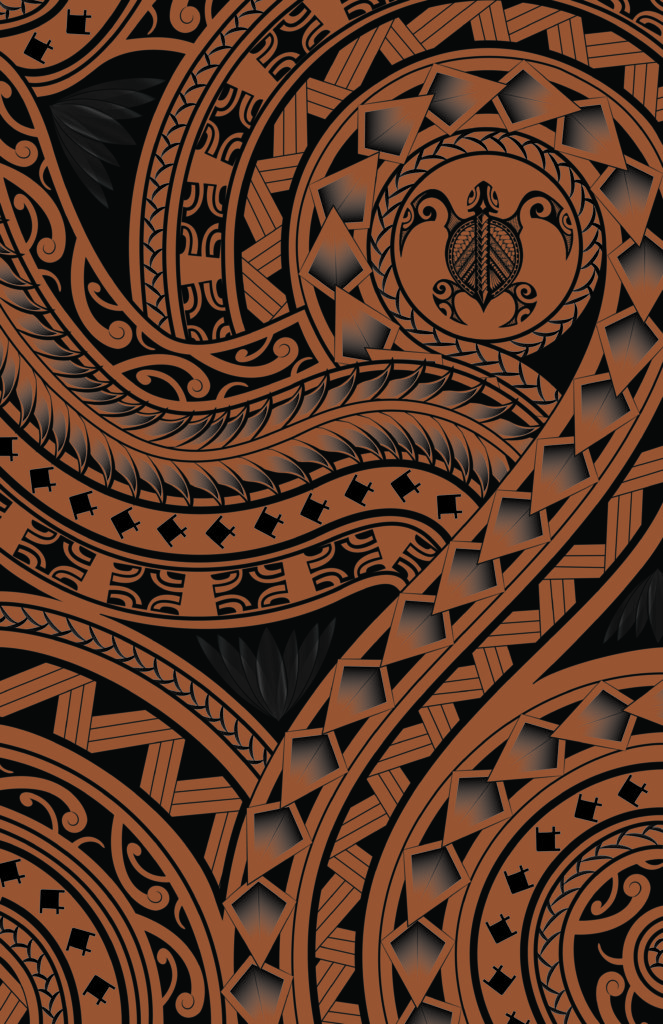
Polynesian Paper Design:
I created a scrapbook album cover for a friend, who requested the cover have a Polynesian theme. I wanted to design the album with a wave cover and Polynesian design for the binding, but could not find a design on the web that suited by needs, so I made my own paper using Adobe Illustrator. Because we wanted to make the album for 8.5″w x 11″h pages, I needs to print the paper on 11″wx17″h to allow for a larger cover size and folding. So I designed the Polynesian paper as 11″x17″ and printed it at FedEx. I drew everything in the design by hand, then essentially traced and modified it’s elements in Illustrator. The only exception is the turtle. Someone had already done the work and I loved their design, so I purchased the vector art to use in this project. Click here to visit Inspirationupload at Dreamstime.com to view the artist’s turtle and other artwork.
This is what the finished album looks like:


Multimedia Design
(after effects, premiere pro, movie maker)
*click on any video to play


Take A Break From Your Tech And Play With Your Pet:
This was an assignment I did in the Interactive Media Certificate Program for San Diego Continuing Education. We were instructed to create a 30-60 second Commercial, Bumper or PSA using Adobe After Effects. I had an idea for the concept “trade your tech for your pet” when I was just playing on Facebook at home and my cat would not leave me alone. I had thought to myself what it must be like from a pet’s perspective and it made me feel guilty that I wasn’t giving more dedicated time to my cat. I thought this would be a perfect concept to implement with this commercial assignment. I made my commercial from all original art drawn in Adobe Illustrator. I made nearly every object (arms, eyes, clouds, etc) on its’ own layer in illustrator so that, when imported into After Effects, I could move everything independently. In After Effects, I used primarily position, opacity and rotational keyframes. I used the typewriter effect preset for the text, puppet pins for the man’s arm when he is petting the cat, and a gradient overlay for the sunset. I used alpha and inverted alpha track mattes to make the clouds look like they’re moving outside in the scene and to make the text and AVMA logo appear as the floor rises at the end. I also used some parenting and several null objects to get things to move in sync, such as all the cat’s body parts. I also used camera layers to pan and zoom throughout the spot. I had initially planned to create my own audio, but due to time restrictions and having Windows at home (no Mac = no GarageBand), I downloaded all sound effects and music from several open source sites which are listed below.
Audio sources:
http://www.bensound.com/royalty-free-music/track/jazz-comedy
https://www.freesound.org
http://soundbible.com
http://www.pacdv.com/sounds/index.html
Rocket League® Promotional Commercial:
This was an assignment I did in the Interactive Media Certificate Program for San Diego Continuing Education. We were instructed to create a short 20 – 30 sec video for the ‘client’ of our choice using Adobe Premiere Pro. My boyfriend Brian loves the game Rocket League® and was really excited when I was brainstorming ideas for this project and mentioned maybe doing a commercial for the game. That night, he got all his friends together online to play a match. They were all actually super excited about it and were 100% on board with saving their screenplay for me, so I got all the footage I needed. I used clips from their live screen play, as well as some of the replay footage the game has available so I would have different camera angles. I also used my phone to record Brian playing so I had some “behind the scenes” footage as well. I made the animations for the Psyonix logo, and the little “behind the scenes” bubbles in AfterEffects and imported them. The screenplay is several clips transitioned together. I used a variety of transitions including zoom/size increase and cross zoom, flip over, additive, film and cross dissolves, and dip to black to fade everything out at the end. I also used color matts as backgrounds for the Psyonix logo at the beginning and the credits roll at the end. For the titles “available on download on Steam, etc” I used a wipe transition and still title, and matched the font to the Steam logo. For the credits, I just used the credits roll preset and set it to start off screen.
For the audio, I made the soundtrack in GarageBand and recorded the narration (provided by my boyfriend Brian) on my phone, an LG G4. To enhance the narrative, I used the audio effects single-band and compressor-voice over. I lowered the levels using keyframes for the soundtrack so that it wouldn’t drown out the narration. I made the soundtrack specifically to match the video while making it, so I didn’t have to edit it too much, but I did clip the electronic from the jazz to make them shorter and transitioned them with the constant gain audio transition because I had gone over the 30 second limit. I then made an exponential fade at the end of the commercial. I also used the speed/duration adjustment a lot, both on video and audio to make everything sync up well. I also obtained consent waivers from all players involved so that I could use their footage and Brian’s voice narration in my commercial.
Preserve Our Earth:
This was an assignment I did in the Interactive Media Certificate Program for San Diego Continuing Education. We were given an audio track (Pendulum_Time Lapse_Audio_File.m4a) and were instructed to create a video in Adobe Premiere Pro using any visuals of our choice, but to focus on staying in sync with the rhythm of the soundtrack. The track reminded me of something inspirational, and environmental conservation is something that I strongly believe in and wish more people would strive for, so I decided to base my content around that. I chose to use animals because I feel that people are more compassionate for animals than their habitats. I obtained all video footage from the open source website https://videos.pexels.com.
Hatch.com:
This was a group project I worked on with three other people in the Interactive Media Certificate Program at San Diego Continuing Education. We were instructed to create a video using Adobe Premiere Pro. This by far was the most difficult assignment because there was so much planning and work that went into it, but in turn it was one of the most enjoyable and rewarding projects I have worked on.
Our group first had a sort of brainstorm pow-wow where we all just rambled off ideas for the video. Our ideas built upon each other and before we knew it, we had a story idea roughly outlined. The concept? Two dinosaurs find love using the popular dating app Hatch.com. Because, dinosaur suits. Yes, and yes.
We then moved on to storyboards. I took the lead on this one. I have a knack for mediating, so as we went through scene by scene and each of our group members expressed what they wanted to do, I did my best to fuse those ideas together and make a story that would flow well. It was really exciting to have our story planned out and we couldn’t wait until our dinosaur suits arrived so we could start recording! (yes, we ordered them specifically for this project, totally worth it!)
It took a few days for our costumes to arrive, so in the meantime, we worked on props. We made a giant paper flower for a scene where T-Rex is picking flower petal (thank you Martha Stewart for the template: http://www.marthastewart.com/269341/crepe-paper-roses). In another scene, Godzilla is reading a newspaper, looking for love in the classifieds. Each of us designed a character profile ad for the newspaper, I used primarily Illustrator to make the Sarah Tops character and then InDesign for the profile layout. Everyone shared their files with me, and I compiled it into one file within InDesign, and then continued on to make the newspaper front and back cover as well as some more “classifieds” pages. InDesign is my favorite program, so I really enjoyed making this prop, even if it is only in the video for a short few seconds. We also created a pseudo ad for Hatch.com for the dinosaurs to use. I created the video ad in After Effects and another group member,Ewelina Giba, created the “you’ve got a match!” notification (I’m honestly not sure what program she used). They’re just videos, but our stellar acting and editing skills made it seem like a responsive app, which I was pretty proud of.
Once our costumes arrived, we spent a few days filming the different scenes I different locations. We generally had two people filming to get different angles for the edits. I only filmed one scene (Godzilla at the bar, of course!), since I was in costume most of the time. We obtained release forms from all of our actors too, just to cover all of our bases.
Once we had all the footage, then it was time to edit, edit, edit. This was not my favorite part, but was worth it when we had the final result. Each of us worked on editing a scene or two. Once everyone did that, I again took the lead as “master editor” to edit all of the individual scenes together. The biggest obstacle for me was dealing with audio and video quality. Since we had each worked on a single piece, all the pieces were a little different. We learned the hard way to export everything in the same format (some group members exported from Premiere Pro using the defaults, while some used the 1080p HD setting, so I had to have people re-export so everything was a consistent video quality). Audio was my least favorite. Again, just because of the differences in how each of us worked on our different pieces. It’s easy enough to change the volume/decibels to match, but the hard part was isolating speaking parts, getting rid of the background noise, and changing the volume to be clear and audible but stay out of the red. I used Adobe Audition and a lot of YouTube tutorials to accomplish this. It’s not perfect, but I was able to get all the audio clear and balanced while staying in the green.
The last bit was to add the credits. Another group member, Ewelina Giba, did the production/actor credits and I made the scrolling music credits, since we used third party music in our video.
It was a long project full of learning obstacles, but when I watch the final product, I am so proud of how our video came out, and our classmates really enjoyed it as well. It is so rewarding to see something you worked so hard on come into being and to see people enjoy it. It was a great experience.
Logo Animation:
This was an assignment I did in the Interactive Media Certificate Program for San Diego Continuing Education. We were instructed to create an original logo for ourselves or another company or client of our choice and animate it in After Effects. I chose to create a logo that would be part of my personal portfolio. I used Adobe Illustrator to create a cartoon vector portrait of myself. I duplicated the portrait and edited the eye and mouth to wink. I also made the logo for my initials in Illustrator. I then imported the AI files into After Effects as a composition so I could adjust the layers independently. I first used the stroke effect to “write on” my logo initials, then used null object layers and parenting along with the opacity, rotate, scale and position transform tools to manipulate the parts of the logo. I imported the paint splatters from the tutorial on http://www.sonduckfilm.com/tutorials/after-effects-paint-splatter-logo-reveal/ and brought them in from all directions to where my vector portrait would be and then back off screen again by duplicating the original key frames. I altered their paths and sizes to make them look like they were moving, then moved the slider for my vector portrait to reveal when the paint splatters completely covered the screen so it would be visible once the splatters left the screen. By adjusting the opacity of the normal and wink layers of the portrait within a short time frame, I was able to make the portrait “wink”. I used the linear wipe and starburst effects to bring in the text “Natasha Nichols, Graphic and Media Design” and obtained the music “Ukulele” from the royalty-free site http://www.bensound.com/.
Mario Party 2013:
I created this slideshow using Windows Movie Maker to showcase a Mario-themed party I hosted in 2013. I handmade every decoration, every game, and 10 life-sized cardboard standups for the party. I also made Mario-themed food, including spaghetti and meatballs with “Bowser-Breath Bread”, “Star-Power” sugar cookies, “Fireball” cheeseballs, and “One-Up” and “Power-Up” cupcakes. For the kids, I made 2-liter bottles with various enemies on them such as koopa troopas and goombas and hid them around the yard. I provided a bucket of “fireballs” (which were orange water balloons) and had the kids attack the enemies with the “fireballs”. I also made a giant block of 12″x”12″x”12″ styrofoam bricks (which were hand-painted) and made a raccoon tail from a belt and plastic bat, which you had to wear and use to knock down the bricks. I also hung a bunch of handmade brick and question-mark boxes from the ceilings around the entire house and garage. I didn’t tell people about them, and eventually the guests figured out that if you punched the boxes, just like in the game, coins came spilling out. Everyone was surprised and super excited to find out about that fun party game. I also made several drinking games for the 21+ crowd, including Mario Cart Drunk Driving, Super Beer Pong and Super Mario Bros 3: The Drinking Game. Everyone had an amazing time and really loved the games, food and decorations.
*disclaimer:”Super Mario Bros”, “Mario Kart”, “Mario”,
“Luigi”, “Princess Peach”, “Toad”, “Yoshi”,
“Daisy”, “Wario”, “Waluigi”, “Bowser”, “Donkey
Kong” and all names and the
distinctive likeness(es) thereof are Trademarks
of Nintendo®
All music and sound effects are the sole
property of of Nintendo®
Web Design
(Animate/Flash, Dreamweaver)
*click on any thumbnail to view web content


Cat Animation:
Content Coming Soon!
Gator By The Bay! Festival Ad:
Content Coming Soon!