Startling Elegance Magazine Cover
Overview:
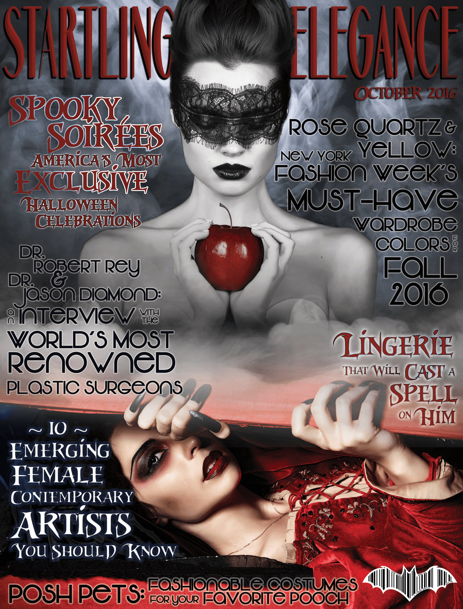
I created this magazine cover for an assignment in the Interactive Media Certificate Program for San Diego Continuing Education. We were given a title and were instructed to design a book cover, magazine cover, or DVD case cover using appropriate corresponding dimensions. The title I was given was “Startling Elegance”. I used Adobe Photoshop to create this design per assignment instruction.
About The Design:
For this project, the title I received was “Startling Elegance” which inspired me to create a high-fashion magazine cover for wealthy women. I also chose to make it an October edition and to keep it fall and Halloween themed, since this assignment was around that time. I had a lot of fun researching articles that would be in such a magazine and coming up with the article titles. I also really enjoyed making the barcode. The most challenging part of this assignment was definitely managing the type. I wanted it to feel like a real magazine. I was very meticulous about the fonts I chose and how I alter the size of each word in order to emphasize what I wanted the reader to focus on without one article being more prominent than another.
Software Tools and Techniques:
I adjusting the leading and placement of each word within each article, and each article within the page. I chose a black, red and white color scheme as I felt this was appropriate for an October/Halloween issue. I ended up only using two main fonts, Riky Vampdator Normal and Vonique 64 for the articles’ text and primarily used only the stroke and outer glow effects to keep everything consistent on the page. I did use a different font, Marbre Sans, with a bevel and emboss effect and drop shadow for the title “Startling Elegance” so that it stood out more from the page. After a LOT of trial and error, I feel that I was able to make the cover look balanced while keeping the type legible but still interesting, while keeping everything consistent with my Halloween theme.
I purchased the two images of the women as well as the two images of smoke from https://stock.adobe.com/. I primarily used masking for the images. I applied a mask to the woman with the apple so I could put her in front of the blue smoke and the title. I used the grey smoke image twice (I flipped it horizontally to fill out the middle of the image better) and then applied a mask to it using about a 10-20% opacity and fill, and repeatedly painted the mask on until the two images of the women blended seamlessly via the smoke.
I found two images of bats on Google and, using the pen tool, traced the shape of the wings from one and the head from the other to create the bat shape for the barcode. I turned the pen tool outline into a selection and used that to create the bat-shaped mask over the barcode, which I obtained from a free barcode generator website. I used the pen tool to create text along a path for the ISSN # and the price in the font OCR A Std (which I researched to be the type of font actually used for barcodes). I then used the pen tool again to outline the shape/create a selection to create a white border around the barcode. photo
Photo Credits:
“Rising Up” by Andrey Kiselev
“Witch Black Lace Apple Magic Sleeping Beauty Halloween” by indiraswork
“Smoke on a Black Background. Defocused. Toned” by Strannik Fox
“Abstract Fog or Smoke Move on Black Color Background” by Jenov Jenovallen